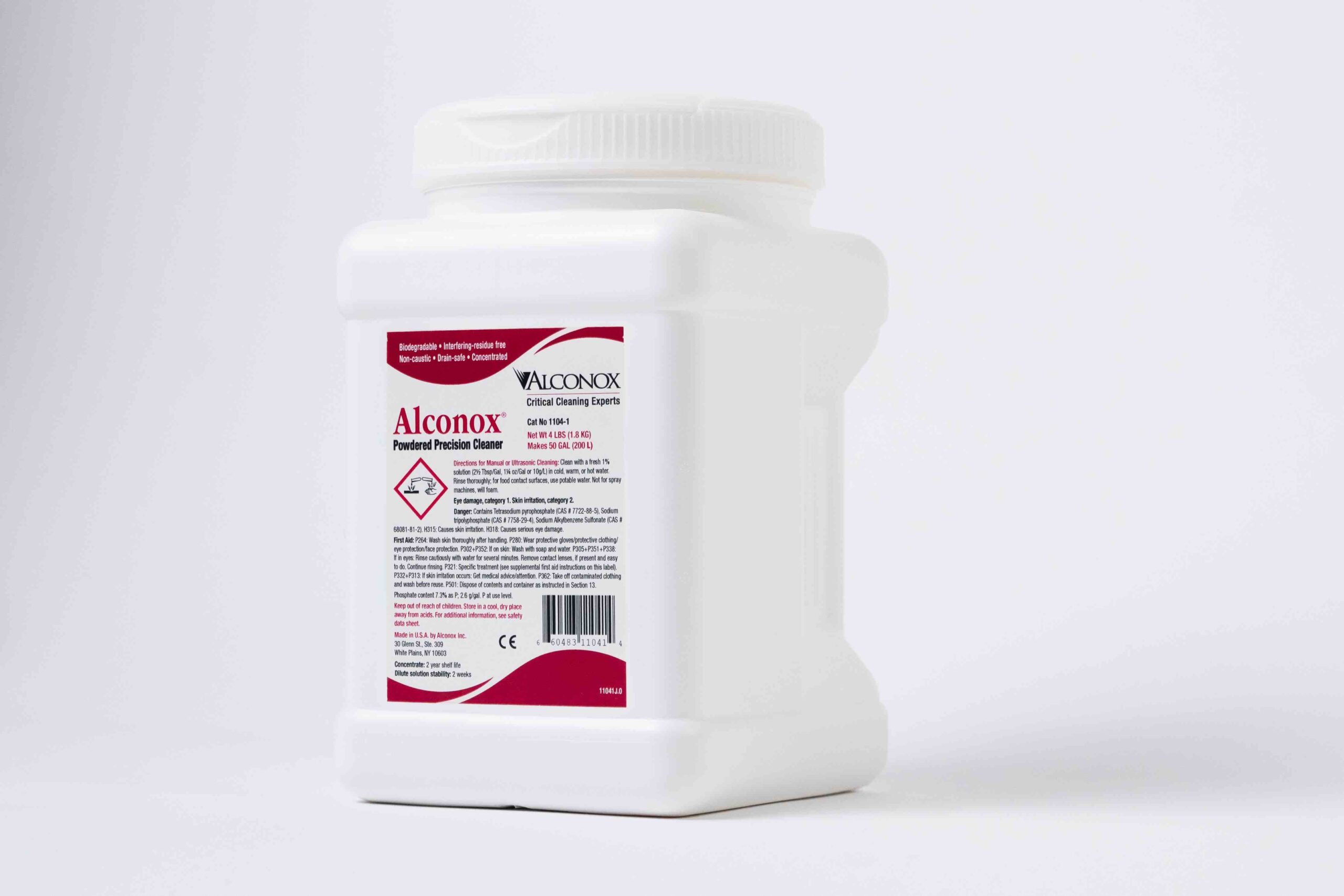
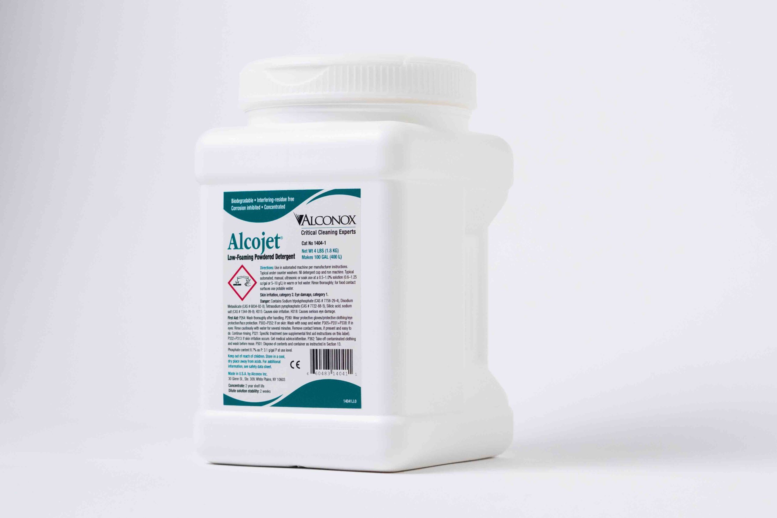
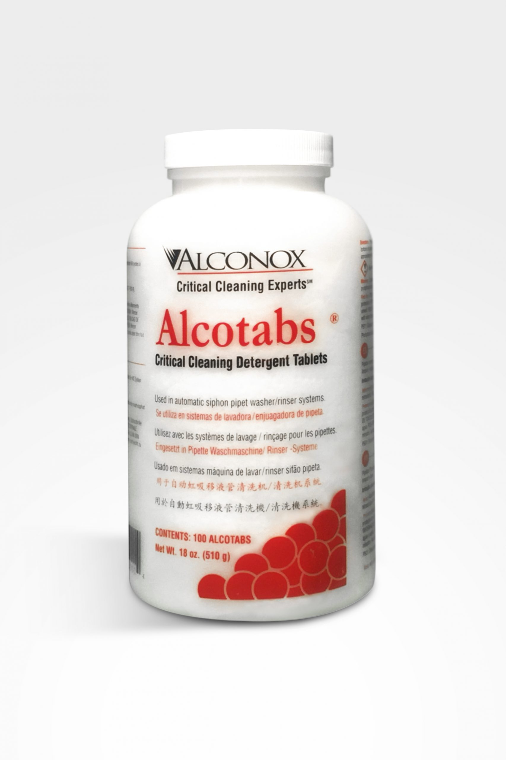
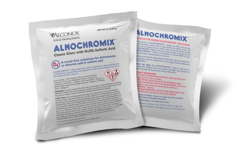
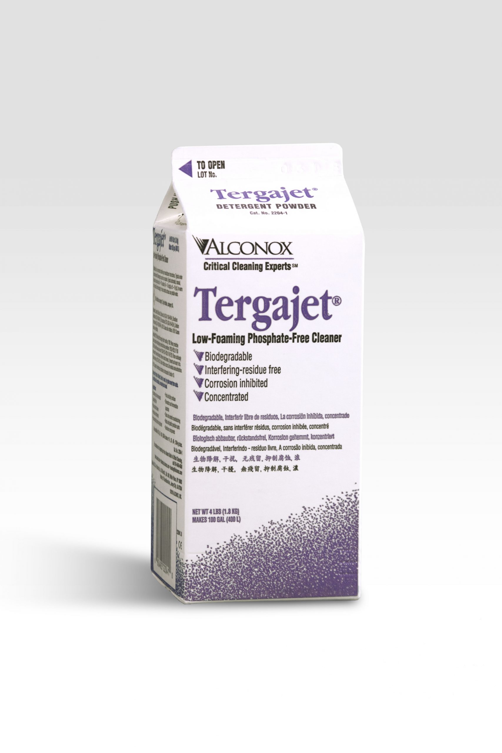
Product Images


Logos
ALCONOX GRAPHIC STANDARDS
We do not have a printed corporate standards manual from our designer, however, he did provide some guidelines. The following guidelines were obtained in discussion and correspondence with the designer and derived from what has worked in the past. The use of the logo, color and typography are addressed below. This is a work in progress and is subject to revision.
LOGO GUIDELINES
We use the term ‘logo’ to refer to the symbol, (the bird like icon) in combination with the name ‘Alconox’ in the particular drawing of the typeface, Trajan, referred to as the ‘logotype’. These two design elements together constitute the logo. Follow the guidelines that appear below for use of the logo.
Do not use the logo in a sentence or phrase. For example, in the headline: “Play the Alconox Match Game” do not use the logo but rather print the name ‘Alconox’ in the same typeface, and type size as the rest of the headline.
The symbol may print in the corporate blue, Pantone (PMS) 3005, black, gray or may drop out white from a dark background. The name, (i.e. the logotype) may appear in black, white or gray. To ensure readability, do not use the logo printed in the corporate blue and black over a dark background or a background with a prominent image. You may judiciously print the logotype over a screened back corporate color that is very light, an image that is very subtle as in the “Powerful Solutions” ad or dropped out white from a solid colored background of medium to dark hue.
In general if you are using the symbol as a design element, it is best to avoid other design elements. Allow space around all elements in the logo. We suggest allowing a minimum of the height of the capital “O” in the logotype on all sides. With rare exceptions do not use a descriptor line, tag line or other copy immediately beneath or adjacent to the logotype. Allow blank space as indicated above.
COLOR GUIDELINES
We have an extensive color palette for our products. Currently, we use a very limited palette for our corporate literature and our website. Our corporate color is Pantone 3005. This color has been used on our collateral materials along with shades of gray, black and white, as well as, 4 color photography. Duotones combing the corporate color (blue) or gray with black have also been used effectively. We recommend Pantone Cool Gray 4M and Cool Gray 10M.
TYPOGRAPHIC GUIDELINES
Headlines:
Serif: Trajan Regular. If possible use this headline font in its original form. Where necessary, it may be condensed slightly (up to 90%) – so that the headlines may appear larger. For example, on trade show booth panels, headline type has been condensed. Avoid condensing type for subheads.
*NOTE, the headline on the inside front cover of the critical cleaning guide is actually Garamond Bold condensed–but we’ve been moving away from using this font in heads. If possible stay away from this font. If you feel it is necessary to your design, keep it at a distance from the logotype.
Sans Serif: Helvetica condensed bold. In the past, this font has generally been further condensed to (85% to 90%) of the original drawing (for headlines only). Initial caps with lower case are preferred to All Caps.
Text:
Serif: Garamond light (in recent years, we’ve been using ITC Garamond light–either will do).
Sans Serif: Helvetica Condensed or Helvetica Condensed Light. Generally condensed to 90% from the original. Helvetica Condensed Light is preferred; however, we sometimes use Helvetica Condensed if there’s a concern over how it might reproduce.
If you are using a computer, for small quick pieces, and you do not have the Helvetica font, you may substitute Arial Narrow Bold and Regular for Helvetica Condensed and Helvetica Condensed Light respectively. For more important pieces that we are printing in larger quantities, please obtain the preferred fonts that appear above.
Try to limit the number of typefaces, sizes and styles. Keep it simple and avoid clutter. In particular, try to avoid using a condensed face and an extended face in the same piece. (Think of the following concept: you don’t need a belt and suspenders, one is enough. Be economical with type, color, imagery and design elements and you will have a more elegant page.)
Type alignment
Wherever possible align type flush left. Use centered type judiciously. When the logotype appears in the same column as other copy, align the type in the logotype visually with headlines and text so that the symbol hangs to the left of the column. Another way to describe this is, align the left edge of a column of type with the bottom left foot of the ‘A’ in the logotype.
